Helping a fast-growing Fintech keep its mojo.
a provocative brand story and refreshed visual identity propel A SAAS FINTECH ahead
PROJECT SCOPE

What They Were Up Against:
Apruve is reimagining how businesses transact with one another. Yet as disruptive and innovative as their FinTech platform was, customers were having a hard time understanding why it was such a game changer. In addition, the brand's visual identity, which featured cartoon-ish monsters, wasn't striking the right note with sophisticated CFOs and controllers.
What We Did:
Speak! guided Apruve through a six-week brand rehab effort that resulted in a simplified brand story. We articulated the brand's purpose in four powerful words: Making Accounts Receivable Obsolete. Subsequently, we expressed the company's story through a clean, uncluttered visual identity.
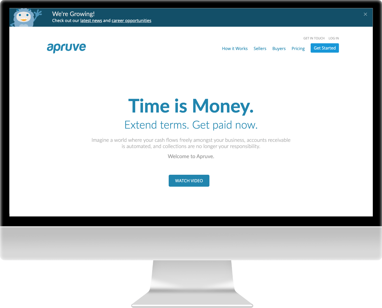
Before
The old Apruve brand and visual identity. Visitors were met with an uninspired design and vague messaging. Monsters appear in the design without context.
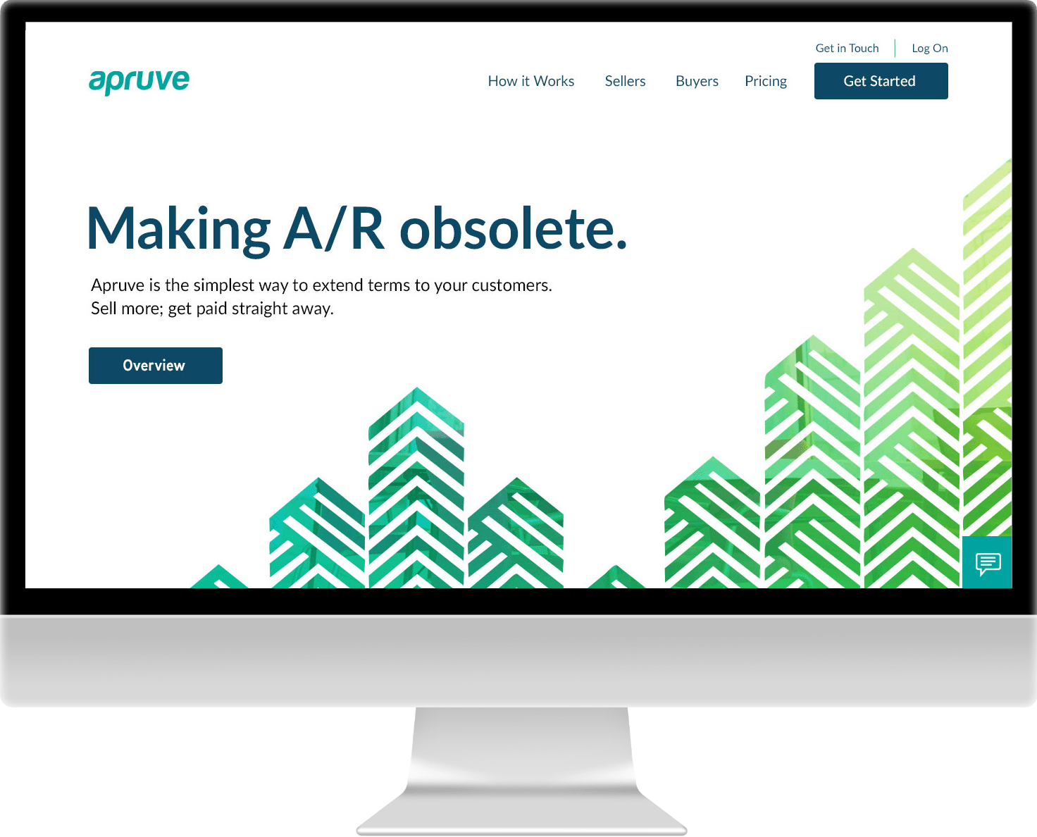
After
Clear, value-driven messaging and a vibrant visual approach to resonate with the target audience by connoting movement and growth in a clear and professional manner.
Move the slider to view the changes in real time.
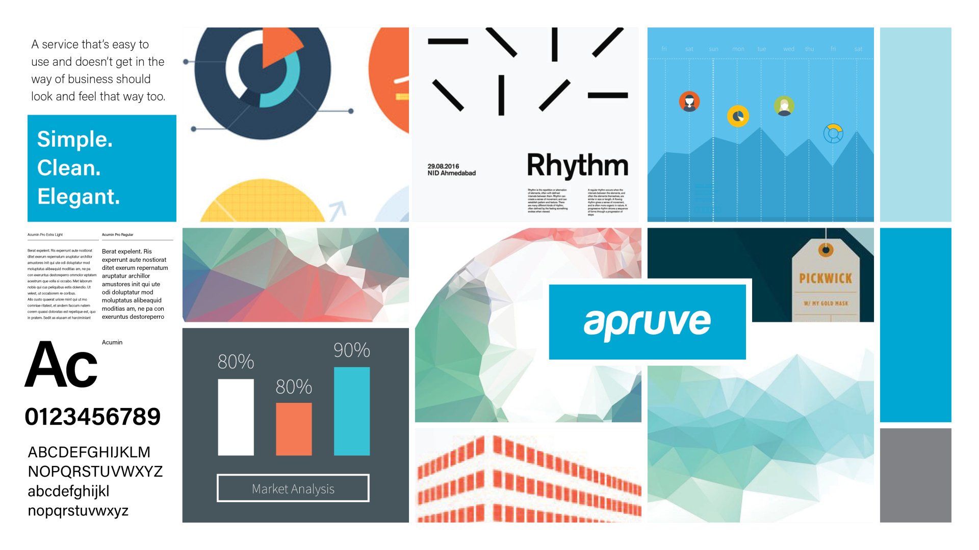
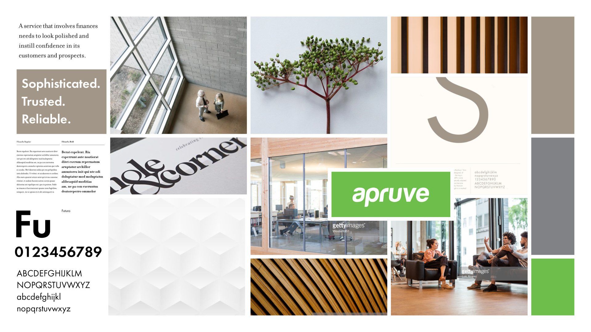
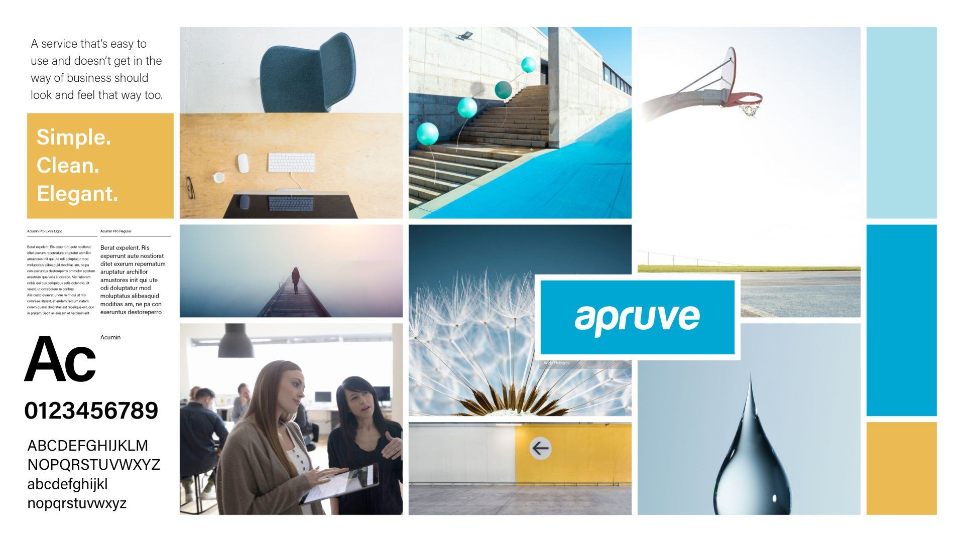
Design Studies
We explored three different visual directions to support the new brand messaging. Each element was carefully chosen to elicit a particular feeling about the brand. The final visual approach was the combination of specific elements from each study.