Refreshing the story for a cybersecurity leader
A NEW BRAND IDENTITY AND NARRATIVE FOR THE LEADER IN CYBERSECURITY AWARENESS TRAINING
PROJECT SCOPE

What They Were Up Against:
As KnowBe4 approached its 15-year anniversary, the company was badly in need of a makeover. An out-dated logo and visual identity didn't reflect the brand's leadership position in its market. KnowBe4 was also in a period of transformation — broadening itself from a cybersecurity awareness training company to a comprehensive Human Risk Management platform. It required a new narrative.
What We Did:
Facing a tight deadline, Speak! compressed the effort into an aggressive 6-week schedule. Primary research revealed customers had an affinity for the brand's orange palette and strong awareness for the "undo" arrow in the logo. Rather than a complete overhaul, we refined the mark and refreshed the color to make it accessibility compliant. A bold, new narrative gave the brand and its employees a rallying cry that resonates.
Before
The old Apruve brand and visual identity. Visitors were met with an uninspired design and vague messaging. Monsters appear in the design without context.
After
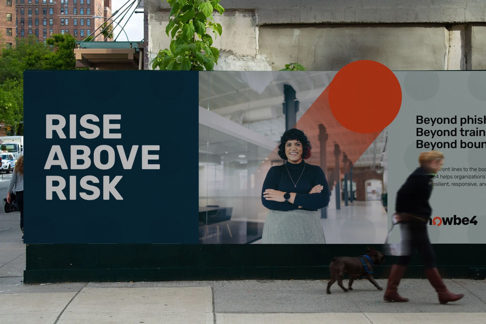
Clear, value-driven messaging and a vibrant visual approach to resonate with the target audience by connoting movement and growth in a clear and professional manner.
Move the slider to view the changes in real time.


Brand Book
We explored three different visual directions to support the new brand messaging. Each element was carefully chosen to elicit a particular feeling about the brand. The final visual approach was the combination of specific elements from each study.
Product portfolio architecture and icon system
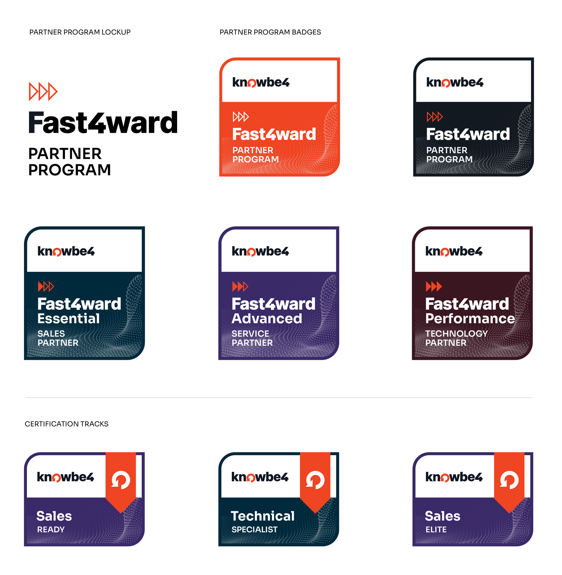
Partner Program naming and badge system